• Hi all and welcome to TheWoodHaven2 brought into the 21st Century, kicking and screaming! We all have Alasdair to thank for the vast bulk of the heavy lifting to get us here, no more so than me because he's taken away a huge burden of responsibility from my shoulders and brought us to this new shiny home, with all your previous content (hopefully) still intact! Please peruse and feed back. There is still plenty to do, like changing the colour scheme, adding the banner graphic, tweaking the odd setting here and there so I have added a new thread in the 'Technical Issues, Bugs and Feature Requests' forum for you to add any issues you find, any missing settings or just anything you'd like to see added/removed from the feature set that Xenforo offers. We will get to everything over the coming weeks so please be patient, but add anything at all to the thread I mention above and we promise to get to them over the next few days/weeks/months. In the meantime, please enjoy!

Spacing after posts on this forum

Dr.Al

Old Oak
Joined
Dec 31, 2020
Messages
3,707
Reaction score
2,494
Location
Dursley, Gloucestershire
Name
Al
Just a forum curiosity question that doesn't really matter.

Is there a (good) reason why there's a big gap after some posts (seemingly particularly those with a signature line)

For example, the end of a post without a signature:
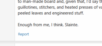
1762874935644.png

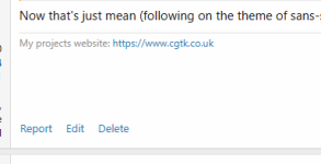
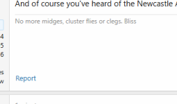
and a couple with a signature:

1762874955205.png

1762874965126.png

There seems to be a lot of unnecessary space above "Report".


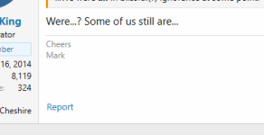
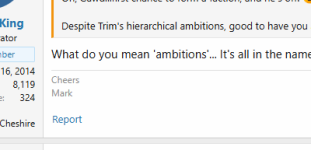
It doesn't seem quite as simple as signature vs non; here are a few of Mark's:

1762875081383.png

1762875090227.png

1762875099833.png


As I said, it probably doesn't matter really, just seems a bit odd and unnecessary.
 
In all the examples you give above, the box to the left (picture / name / stats / etc.) is driving the height - it will set a minimum height unless the content of the post is longer...

So overall height will be the taller of that box / the message box.
In all your examples except the first, you can see that the bottom is driven by that left box
In the first post it would appear that there is more content to the post, so it has pushed down lower than the left box
 
Ah, ignore me, I get you now.

So there's a 'standard' depth to the content box if only one line of text, then when the content fills that box (which looks like 7-9 lines of text) then it will push the auto-sig to the bottom, then start pushing down lower.
 
Ah, ignore me, I get you now.

So there's a 'standard' depth to the content box if only one line of text, then when the content fills that box (which looks like 7-9 lines of text) then it will push the auto-sig to the bottom, then start pushing down lower.
sort of - the standard depth is driven by the grey box on the left containing your name...
We can set more or less information there and for example, your location goes onto a second line, mine doesn't / I have my name on mine, you don't - so it is not standard across all users - but is per user...

The signature sits under the post content - so the white space below it (if there) is because it is needed to make the right and left boxes line up...
so technically nothing to do with the signature per se. For every extra line of post content, there is a need for one less line of that white padding / extra space... Once the post and signature depth equals the depth of the left grey box, any additional post content simply means you need space at the bottom of the left box now to keep them all level... So in my post above, there is no quote and the post is short enough that white lines appear below it to make the boxes line up... on this post, I quote and my writing is longer, so no space below here, but space on the left at the bottom of the grey box...

All about making it look pretty!
 
Back
Top