• Hi all and welcome to TheWoodHaven2 brought into the 21st Century, kicking and screaming! We all have Alasdair to thank for the vast bulk of the heavy lifting to get us here, no more so than me because he's taken away a huge burden of responsibility from my shoulders and brought us to this new shiny home, with all your previous content (hopefully) still intact! Please peruse and feed back. There is still plenty to do, like changing the colour scheme, adding the banner graphic, tweaking the odd setting here and there so I have added a new thread in the 'Technical Issues, Bugs and Feature Requests' forum for you to add any issues you find, any missing settings or just anything you'd like to see added/removed from the feature set that Xenforo offers. We will get to everything over the coming weeks so please be patient, but add anything at all to the thread I mention above and we promise to get to them over the next few days/weeks/months. In the meantime, please enjoy!

Some Letter Carving

Argus

Sapling
Joined
Nov 26, 2020
Messages
260
Reaction score
2
Location
Ceredigion Uplands
I’m an occasional carver…… and lately, during the lock-up I have taken up some letter carving.

I’ll add that letter-carving is something that crops up with me from time-to-time when someone moves into a new house….. they get a house-name as a moving-in present.

That aside, lettering can use up otherwise redundant off-cuts that are too good for the fire and too small to use.

Anyway, I thought that I would use a chunk of Oak that has lain idle a long time because of its unsightly and troublesome streak of sapwood, so with that sawn off, I had a piece about 40 inches by 4 inches, one inch thick to play with.

I came up with this Middle-English quote from Chaucer.

IMG_0882 - A.JPG
This is the piece sawn in two and the script marked out on the left... the bit on the right is now truly scrap
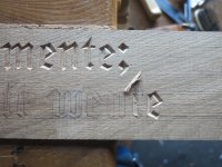

IMG_0888.JPG
I tend to work from right-to-left.....


IMG_0894 - A.JPG
The finished piece, at least to the first stage. I'll now leave it for a while, then go back and trim the cursive elements a little and add a few serifs.
Until then it's still WIP for a while....


The lines by Geoffrey Chaucer, are from 'Troilus and Cressida' .

I hope that it still strikes a chord after 650 years!

.
 
Thanks to all for the kind comments

Andyp":15l58o8z said:
Great font choice no curves.

Andy.

That's the next part that I mentioned......... some of the cursive elements 'o', 'd' etc. do have some very slight curves on opposing sides.
That's what will be added later, plus a few serifs here and there.

Some work I do free-hand... others, as in this case, I try to use an appropriate style of font.
Chaucer was one of the earliest writers to be printed in English and I have used a font adopted from one in use close to that time.
 
I'd call that a definite success.
Scrolling slowly through the photos, I was a bit worried by the long streak from a less than perfect planer blade and was trying to work out a polite way of pointing it out - but of course there's no need!

Will you be leaving it all natural or will you be painting/gilding inside the letters?
 
Andy, thank you for the compliment.

The planer marks are more than obvious and this was a very old piece of scrap. I have changed the blades since then!


When it comes to lettering every carver tends to work out their own method of working, including breaking a lot of rules when it comes to tools and gouge shapes! I tend to carve first and then clean the surface as I work.

The layout is to outline the script in carbon-paper/pencil, then to define the outer edges with with a faint knife cut - enough to sever the top fibres and give me a clean border to pare back.

When the script is cut, I then clear the area around that letter with a card-scraper, which removes all the pencil marks. As the whole thing is completed, all the planer marks are removed in a gradual process. It allows me to focus on each letter as it is completed.

The next step is to add some very slight curves, some serifs then to seal the cut edges with a couple of coats of knotting before painting with acrylic. Finally, I give the lot a few wipes with Danish oil.

.
 
Nice thread. Good work. I need to do some lettering myself so this is very useful and helpful.
 
OK. Here is what I usually get wrong (usually I do signs by routing, but looks amateurish compared with what you do). What is your system for laying out so that you get letter spacing that looks good? Do you vary the spaces between letters depending on letter width?

I see that you've marked centre lines for every letter. Do you have to chop down the centre and then do the side cuts?

What fonts are best for a beginner. Gothic fonts seem to have straighter lines and that presumably is easier. I like yours even without the curves. Why don't you mark the curves?

Gave you tried Japanese Kanji lettering? I only ask as I need to do some over the winter.

Is it worth roughing out the bulk with a V router first? (I only really have oak available and it's quite hard).
 
Adrian,

Thanks for the response and the questions. Glad to help if I can.

Every carver has their own methods….. here are mine! When it comes to letter carving, you can count the books worth reading on one hand, likewise the videos out there in the wild.

It’s been said that electric routers do a good job. I may add that they are the tool of choice if you are producing functional signs. I mentioned house signs – I generally give them away as a gift not only to the house owner when they move but a ‘gift’ to the house.

I don’t use a router, and very rarely a Vee-gouge. Neither do I use a carver’s No: 1 straight chisel. They are bevelled on both sides and I cannot get on with them, at all.

It doesn’t always work with house numbers, but where I live almost all the houses have name that go way back in time, usually in Welsh, but I do it all by hand….. slowly, one letter at a time, silent (I seldom use a mallet) and totally non-viable if you are earning a living. I try to avoid twee sayings, and to provide a little work for the reader to do….hence a bit of Chaucer in Middle English, as it was written.

I have never done any Kanji work….. but I’d be very interested in swapping ideas if you get going on that style.

Layout? First, whatever you are carving, don’t go small in size. It is more difficult. Also, avoid brittle or splintery wood – it will drive you mad. Sometimes, little bit breaks off…. The solution is to stop immediately then, either burn the lot and start again, or stick the fragment back with super-glue. I do the latter – that’s the first rule gone west. The essential tool here is a card-scraper to remove any evidence that you broke a bit off.

Method? The simplest method is to print directly onto paper (at least 150 size font which will be more than 1 inch tall), glue it down on the wood and carve right through it. The main problem with this way in is getting the glue off afterwards, but it is a very good way to start.

Or better, print the text, then assemble it and trace it onto the board. Here, you can experiment with size and spacing, slope and bends. The only rule here is “if it looks right, then it is right”. Let your eye be the judge and take your time. Look at it, go away, look at it again….

Then, most complex way is to draw the calligraphy freehand, then proceed as above when it come to tracing the image onto the board. Here it is worth remembering that what works for the nib or the brush (Kanji, perhaps) on paper needs to be transferred to a cut image from a chisel or gouge that is now exploiting the written image which will be seen by viewers as a set of shadows and the shadows will change with the light-angle.

Centre line: the process I used here with the Chaucer quote was to assemble the script in a font that was based on a type-style that was based on the geometry of one used by printers in the 16th Century.

Next, it was traced with a carbon copy onto the wood (planer-marks and all!). Some lines were reinforced with a pencil, then, as you saw, the centre line above the ‘root’ of the letter is marked, along with a cross-cut at the ends of the line to terminate the cut. Finally, I outline the edges of the letter with the tip of a sharp marking knife – the same one that I use for marking out dovetails.

The centre line above the root is where I make the first cut vertically down wards, then slowly pare back each side to the cut mark on the edges. Then the intersections and finally the terminal ends or serifs.
The most complex shapes are the cursive elements, ‘D’. ‘R’ ‘S’ etc…..

On this font, which originated from the image of a flat nib shape on paper, the curves are applied to some of the straight elements, and they are very slight, in order to fool the eye and I will cut all that later. It is done by eye and goes back to the motto, “if it looks right, then it is right”.

Apologies for the length, but I hope that this answers some of the questions….. all best from the wilds of Wales
 
Super helpful. Thanks very much. What book do I buy? Lettercarving by Chris Pye? Happy to get whatever you recommend. Adrian

PS. The point about shadows had not occurred to me so thanks for that. It's highly relevant as I want to do traditional Japanese posts for our Japanese garden. The Kanji arrangement is always columnar and the orientation of the post is important. Kanji calligraphy is usually brushed and I will not be able to replicate this with carving, so I will need to use a solid letter form.
 
Adrian, glad to help if I can.
I expect that there are angular forms of Kanji that will adapt to chisel cuts. I'd be interested to see how you progress with that idea.

The concept of shadow on incised script is crucial. Without shadow, Cuneiform would be illegible as well as the first alphabets in stone that originated with the Greeks. I would expect that is the case with inscribed Kanji, too.

Books?

As I said they are few and far between letter carving is not a mainstream of the craft.... however, Chris Pye's book is probably becoming the classic after 25-odd years.
If you look online he has a subscription carving tutorial series that has a good sub-section on lettering as well as the other more mainstream carving that he specialises in. You will definitely learn a lot about sharpening and staying honed, which is crucial.

Check out David Fisher's Blog. He is principally a bowl carver who produces some excellent forms, but has also done some very interesting lettering which can be seen on his Blog, if you do some searching.:
https://davidffisher.com/blog/

Finally, there's a new book on lettering this year by Martin Wenham, who also has an introduction film on Y-T:
https://www.crowood.com/products/art-of ... tin-wenham

But, as I said, be prepared to absorb very slight contradictions in each style of lettering, but get carving and do what works for you.

Above all, don't get led down the path of exactitude for its own sake. The eye is very forgiving and won't thank you for turning out stuff like a machine!

Help if I can, keep in touch.
 
Thanks Argus. I've ordered the new book you recommended.

I've also looked at tools. The ones Chris Pye recommends (Auriou) are eye wateringly expensive. I will only do this occasionally so I am hoping I can press my socket chisels or Japanese chisels into use. I don't have a V cutter and that seems to be the weapon of choice for the centre line.

The chisel sets sold as "carving chisels" don't see to be what letter carvers actually use.
 
@Windows:

You’re right, David Fisher uses knives for his flowing style of letter carving. It seems to me that the use of knives as an extension of ‘chip carving’ in the States is more prevalent than here, also he mentions that the wood that he’s using in the examples is ‘Butternut’ which is a very compliant carving-wood that is soft in structure, rather like our Lime or Jelutong. Knives need rather more single-handed strength than I can apply nowadays, plus my wood of choice – in other words, what I have available! – is Oak…. Very hard in texture.

@Adrian,

I hope that you enjoy Martin Wenham’s book. As I said my tools for lettering have accumulated and adapted in shape over some years and it’s reassuring to me that Martin Wenham’s tool technique coincides to a large extent.

Vee tools?
Useful, but not essential for lettering, in my opinion…. Unless you graduate to Peter Follansbee’s style when it is part of the kit. However, if you do go for one, I’d suggest that 45 degree-Vee is the most useful. But be aware that it’s probably the most complex carving tool of all to sharpen properly and you’ll need narrow slip-stones and a lot of patience.
In terms of alternatives to a Vee, when the shape outline is made, the root-line (centre-line) of a straight element is the first cut and you can do this with a vertical cut with an ordinary bevel-edged chisel; then define the ends of the cut and slowly pare back on each side to the marked edge with the same tool. A typical cutting angle is about 30-40 degrees, but it's open to preference. It goes without saying that edges must be razor-sharp!
That's the absolute basics....

As for expensive sets of tools? Avoid sets or kits…. You’ll probably use one or two and the rest will gather dust, so it’s best to buy as you go and buy as you need.

If you are intent on carving some full-sized Kanji signs, it would help if you could show a picture of the images that you have in mind.
My memory of Kanji in Japan is incomplete and quite old now, but if I recall, the print-form of Kanji script is composed of few cursive elements and this will help you make signs in wood.
If most of the lines are straight, tapered or only have slight curves, I’d suggest that you can use ordinary western bevel-edge chisels. Except for a couple of the cursive letters in my sign – the ‘a’ and capital ‘O’ .all the cuts were done with ordinary chisels.

I’m happy to explain how I do things if it helps this project.

.
 
Thank you. I would be interested in some recommendations on how I can get going with minimal tool outlay. What do I really need? I have western and Japanese chisels, knives, mallets etc but no rifflers or gouges.

These are some of the Kanji I need to carve in posts over the winter. There are in fact about 40, but the fundamental building blocks (rationals) are all much the same across the gamut. They need to be done one above the other in a vertical column.
kitchen kanji.pngsilk kanji.pnggarden kanji.pnghouse kanji.png

This is a narrow font, but I may choose a broader style. I will have to draw this myself though as I can't find exactly what I want on the internet as what I am trying to get to is a brushed form that is typically wider and bolder. Each Kanji symbol grouping will be about 2" tall, so say I had 4 to make a phrase, that would be 8" plus three spaces.

My Kanji is presently rudimentary currently (it is difficult for me to learn, though I am trying), so I struggle with Japanese computer font sets as I can't read it well enough to be sure I have it right. However, I will get round that as we have Japanese friends in Japan. I need to do a house sign in both western script and kanji, so I'll probably do that first. When I do the posts I don't want to waste the wood, so I will build up enough skill first.

Great thread. I'm keen to try this now we have entered winter time!

Thanks for the encouragement. Don't let me derail your thread - show us more. Adrian
 
Thanks for the link Windows. That's interesting too. I've tried using a small knife in oak. It's much more tricky than I expected and it's easy to slip. He does a few Chinese letters, but he does them rather straight. To get authentic looking Kanji I will need to embrace curves. I tried it with a router and a dremel and it looked absolutely amateurish.
 
Adrian,

Thanks for the pictures...... looking at the images, the good news is that it isn't an over-difficult project if you break it down into small bites.

The better news is that you don't need rasps and rifflers for this sort of work. The even better news is that most of it - probably 80% of the cuts - can be done with ordinary bevel edged chisels. You don't even need a mallet, unless you want to make a noise.

However, the other side is sharpening. All the tools need to be razorised all the time and I use a leather strop a lot for that - so you need a decent strop and pastes as well as the stones of your choice.

The gentle curves can be done with ordinary chisels, (Martin Wenham's book is good on that). The leveller is that, if you intend keeping the tighter curves, you will also need a couple of basic gouges, two or three, but not a vast hoard of tools on the wall.

One thing that occurs to me is that between us we could take over this thread.... whether the mods and other members are happy with that??????

Any ideas, Gentlemen?
 
Argus":26gl27e4 said:
One thing that occurs to me is that between us we could take over this thread.... whether the mods and other members are happy with that??????

Any ideas, Gentlemen?

You started the thread so it’s up to you. Personally I think when Adrian is ready a new dedicated thread to his Kanji Carving would be a great idea.
 
Thanks, Andy.

I'm more than happy to explain how I would approach that little job, though there are plenty of views on how these things are done.

As far as the Chaucer carving is going, I'm now going over some of the script adding very slight curves, then it will be sealed and painted.

I will try to do some before/after pictures......
 
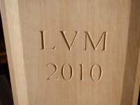
This is a great thread! Fabulous work there Argus. I have done a very small amount of letter carving, working mainly from the Chris Pye book and this excellent video on the Fine Woodworking site. This was my first attempt, set into the centre panel of a blanket box I made for our daughter 12 years ago. I printed the letters and numbers out in Times New Roman, transferred onto the wood using carbon paper (try explaining the concept to a teenage shop assistant!) and used my existing bevel chisels for all the straight edges, and a small selection of gouges for the curves. I found English Oak to be too hard to carve entirely by hand so used a mallet. Argus - I like the idea of using your technique to use straight edges to negotiate the curves. I really enjoyed the entire process and would urge anyone with half an inclination to give it a go.

DSC03664.JPG

DSC03671.JPG

DSC03735 (1).JPG
 
Roger, that's some very fine work on the chest. A chest like that is one of the things that I have never made; the date and initials is a fine and traditional touch.

I like to think that some of the pieces we make will outlast us many times over and the initials will live on.
 
Argus":1h4n541q said:
Roger, that's some very fine work on the chest. A chest like that is one of the things that I have never made; the date and initials is a fine and traditional touch.

I like to think that some of the pieces we make will outlast us many times over and the initials will live on.

Thanks Argus. Of course she's no longer LVM but now LVJ, but the "M" was easier to carve than a "J" would have been. I was tempted to wait until 2011 for the same reason. :lol:

By the way, I would like to underline your advice to ensure that your chisels are super sharp. They really need to be freshly sharpened. If they have been used on a previous job they WILL NOT be sharp enough. Also time spent on accurate layout is time well invested.
 
Back
Top